Platform Navigation Redesign
Redesigning Vasion Automate's global navigation to solve localization and scalability blockers.
Context
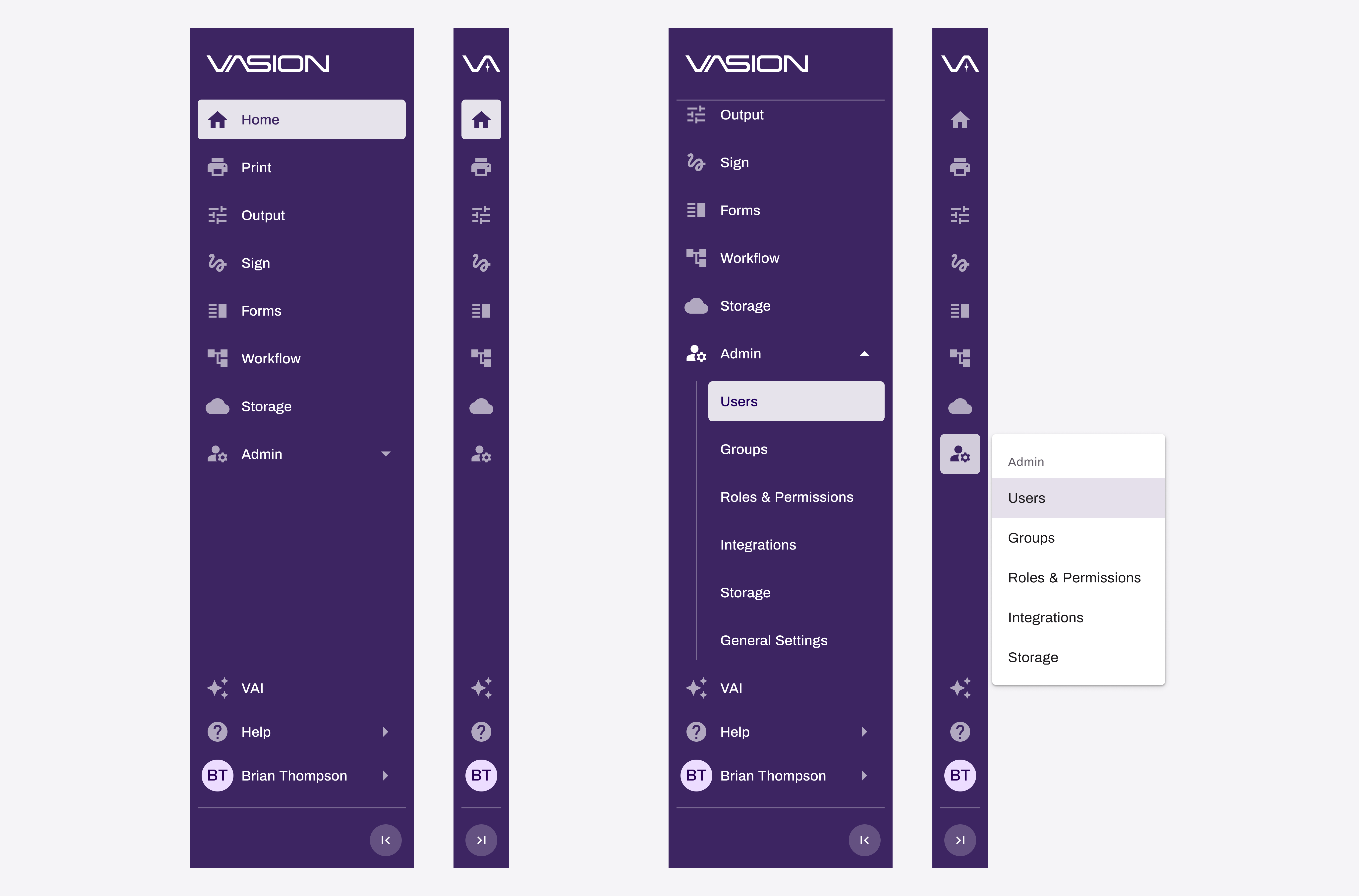
Background. Vasion Automate unifies automation and print tools on a single platform, and it was actively scaling. Our existing navigation was a static Material Design rail: icons with labels crammed into a narrow column. When the team tried to add a "Sustainability" feature and couldn't fit the word, it made the underlying problem undeniable. The nav was a structural blocker for adoption. I proposed the redesign and made the case to prioritize it before things got harder to fix.
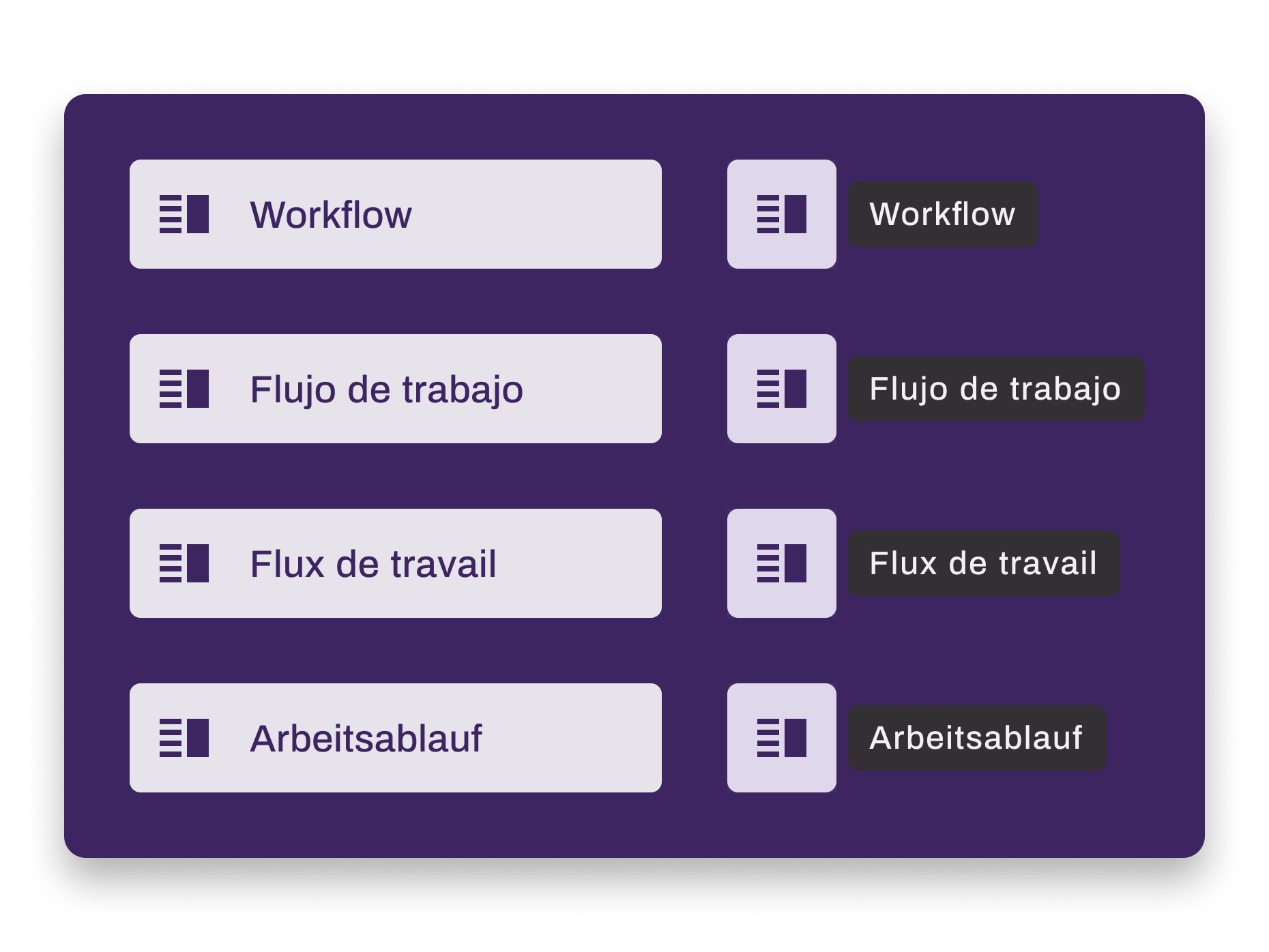
The Real Problem. This looked like a UI refresh, but the real problem was architectural. A fixed-width rail with a hard character ceiling meant we were designing around our navigation rather than with it. English labels were constrained to short words, and localization was effectively broken for languages with longer vocabulary. No amount of copy editing would fix a layout that couldn't flex.
Constraints
Timeline Pressure. The initiative was design-led and had to fit within a narrow gap in the engineering roadmap. Design work was accelerated to hit that window.
Framework Nuances. During development, Vuetify tooltip behavior and other front-end edge cases required close collaboration with the principal developer to resolve without design concessions.
Stakeholder Resistance. Engineering directors initially pushed back: "we have other priorities and this will take too long." My manager and I reframed the nav as a showstopper for platform adoption, using the Sustainability label as a concrete, visible example. That shifted the conversation.
Scope Discipline. Early concepts explored broader navigation improvements, including subpage navigation patterns. I made the deliberate call to scope down to the global nav only, protecting the timeline and keeping the solution focused. Broader nav patterns remain on the roadmap.
Key Decisions
Scoping Down to Survive. Early concepts explored subpage navigation improvements alongside the global rail. The work was promising, but including it would have blown the timeline. I cut scope to the global nav only. We shipped clean, and the broader work has a clearer path forward now that the foundation is stable.
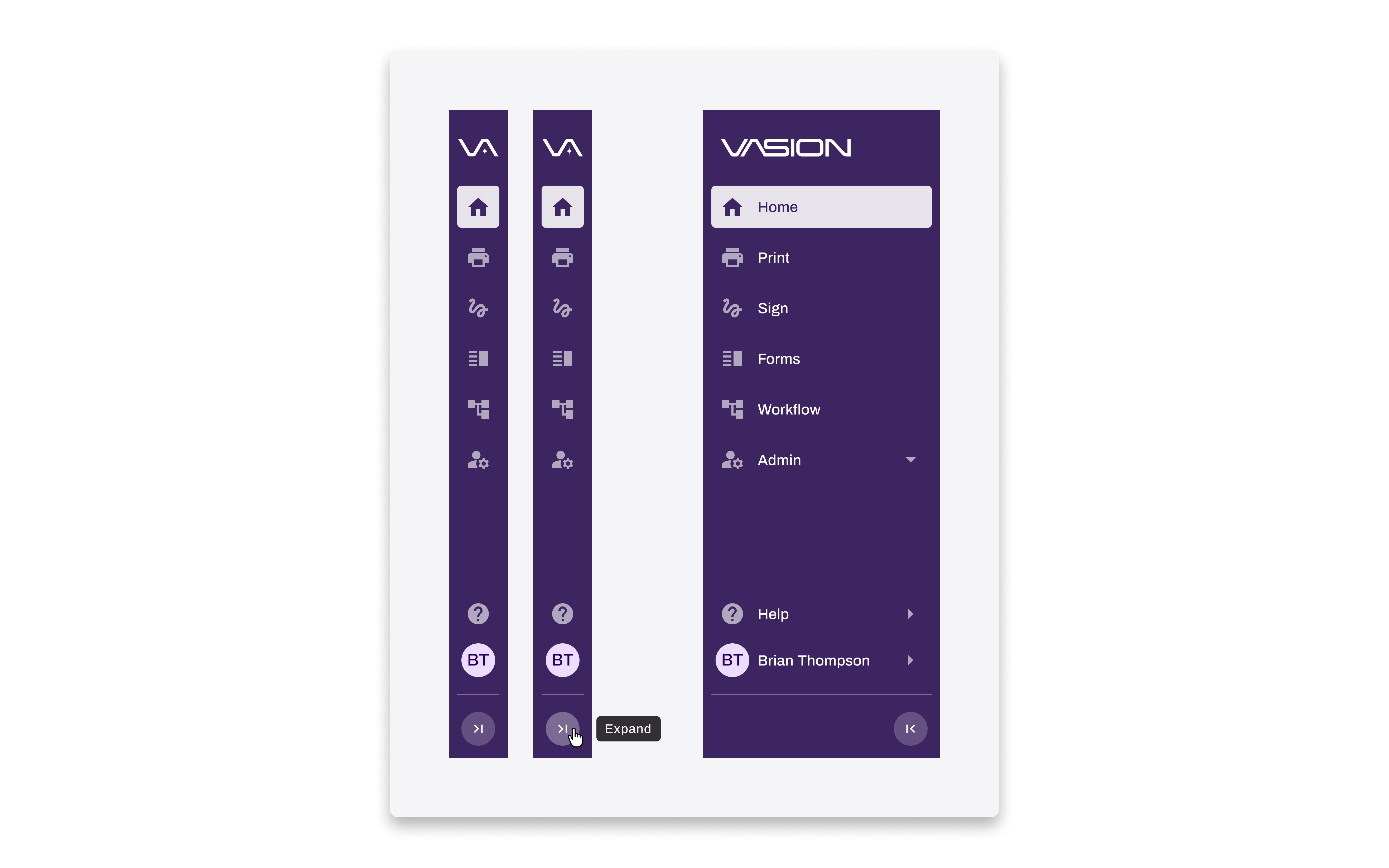
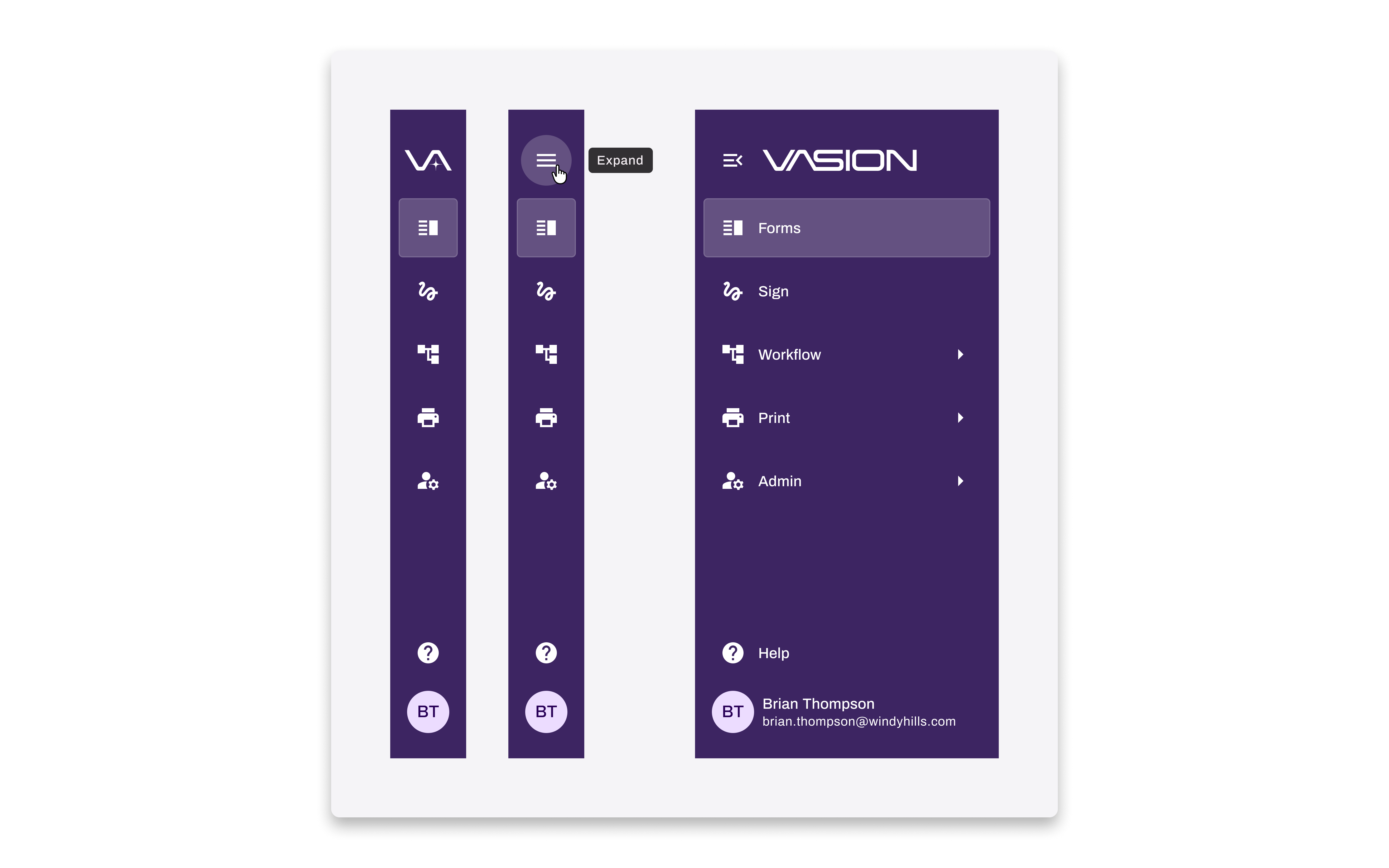
The Expand/Collapse Button Discovery. My original design hid the expand/collapse control behind the Vasion logo on hover. Usability testing showed users couldn't find it. I moved it from the top of the rail to the bottom, which research confirmed is equally conventional. Once in an expected location, users found it immediately.
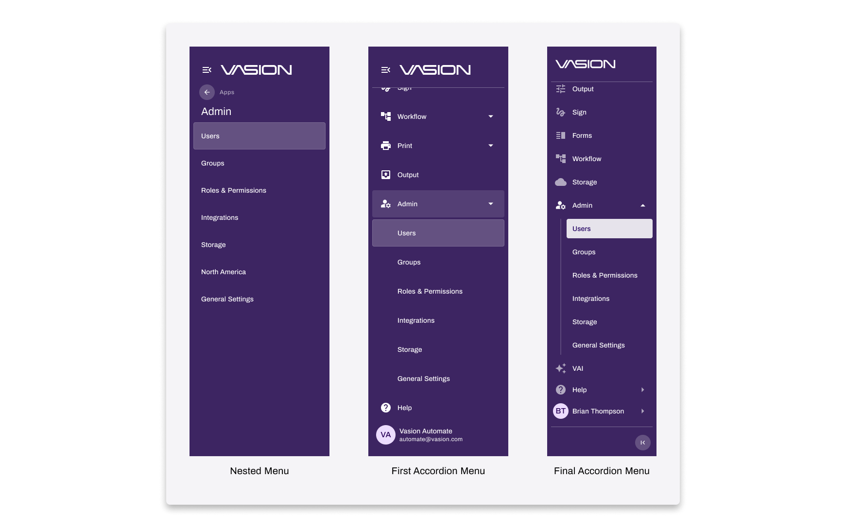
Accordion vs Nesting for Subnav. Both patterns tested well, so testing alone didn't decide it. I chose accordions because they kept the navigation on a single plane, aligned with my guiding principle: Location awareness orients users. Nesting required users to track depth; accordions kept them grounded. It was also the simpler system to maintain.
Holding the Line on Nav State Consistency. During development, one app struggled to resize content dynamically when the nav expanded or collapsed. The developer proposed keeping that app's layout static. I pushed back: one app behaving differently would undermine the whole experience. My guiding principle was Predictable navigation builds trust. I asked him to dig deeper before accepting the concession. He found a solution. The nav holds its state consistently across all seven apps.
Outcomes
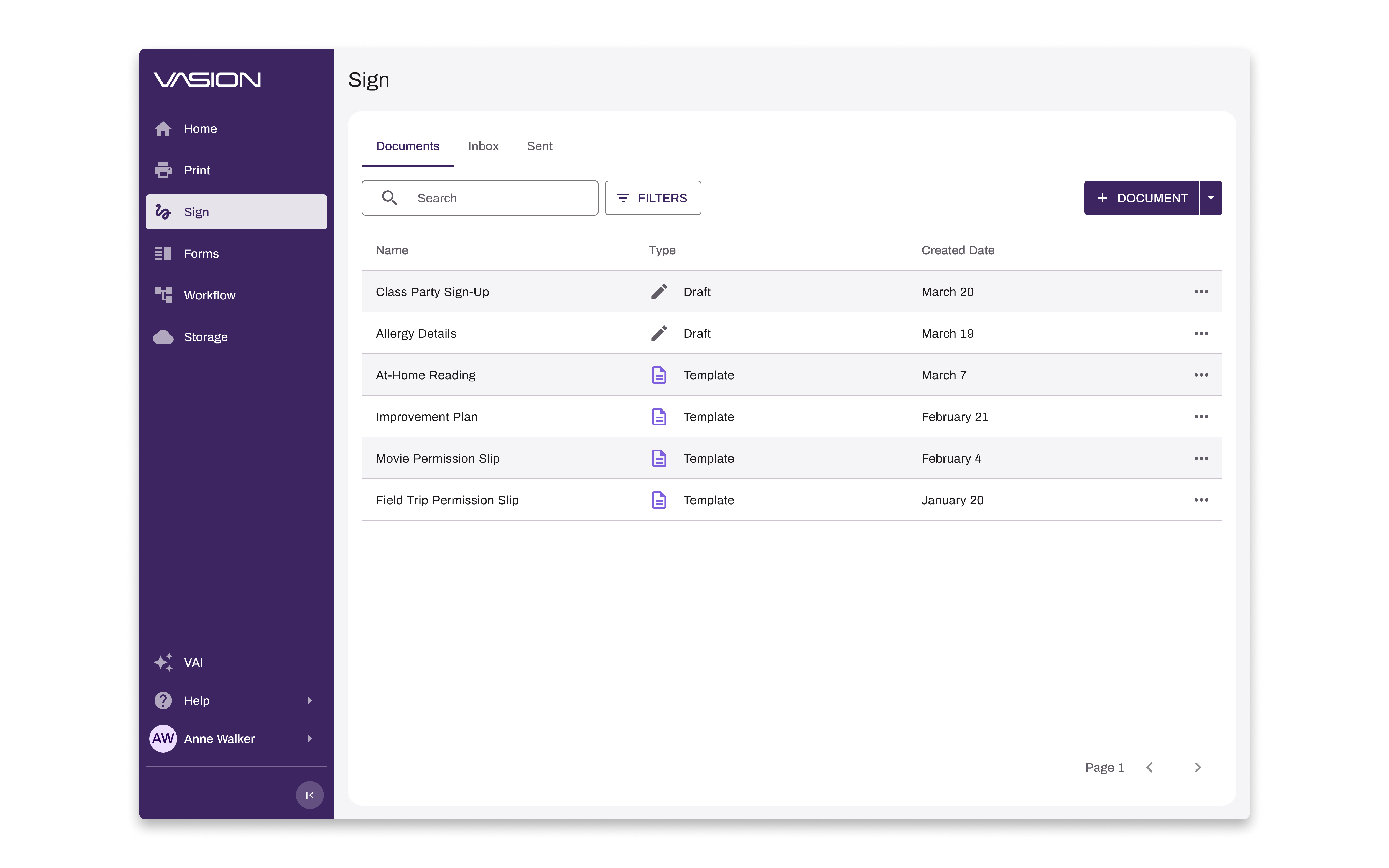
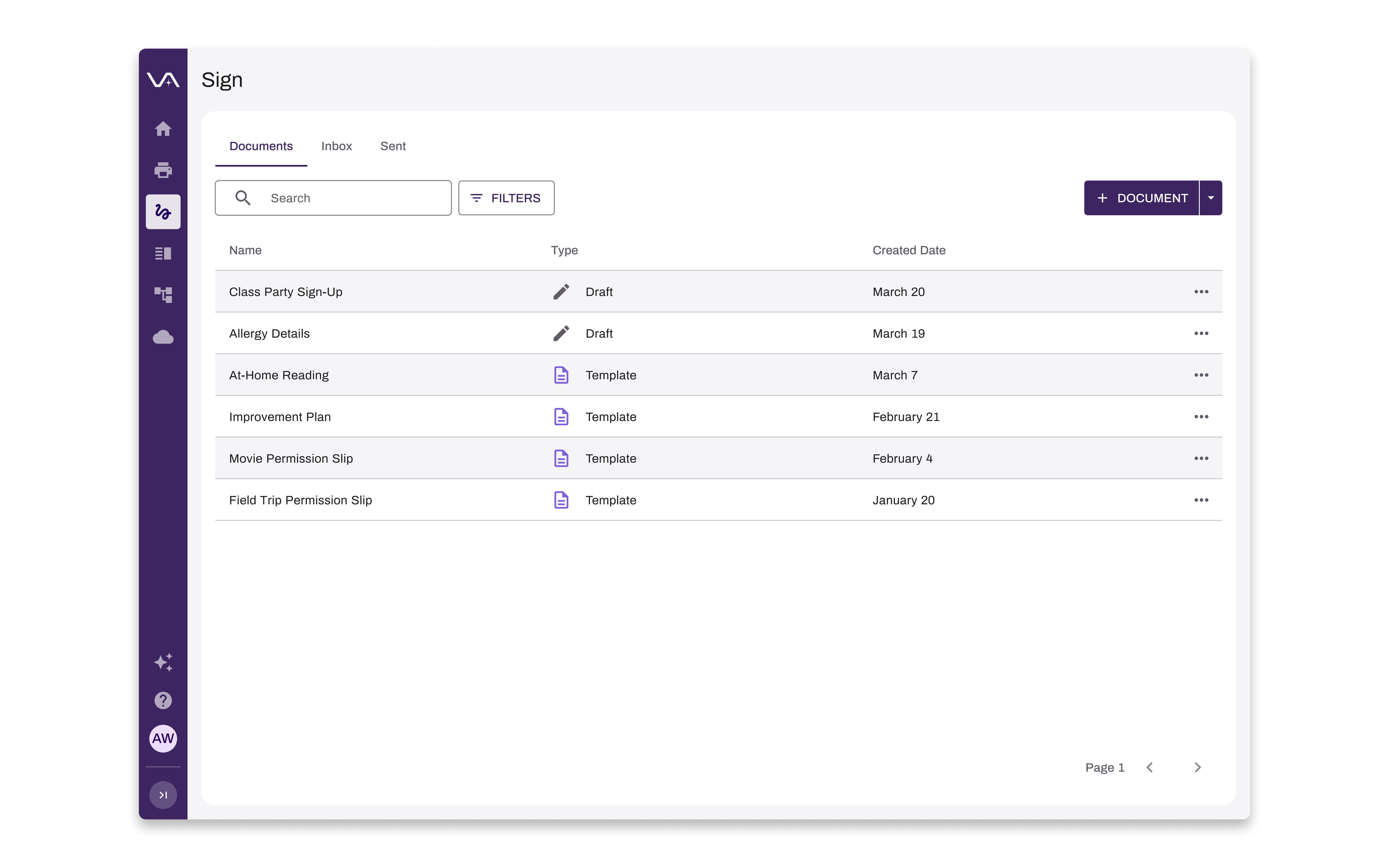
The redesigned navigation shipped and has been in production for nearly a year across thousands of users and seven apps. Localization issues are resolved: labels have room in the expanded drawer, and the collapsed rail surfaces full labels via tooltip regardless of word length. Complaints about navigation, which had been frequent enough to stall feature decisions, effectively stopped. The project also produced navigation governance guidelines, giving the team a framework for deciding what earns a spot in the nav so the system stays intentional as the platform scales.
Reflection
Scoping this project down was uncomfortable at the time. But shipping something complete and solid, rather than something ambitious and at risk, was the right call. If I were to revisit anything, I'd run localization-specific testing earlier rather than treating it as a known problem to solve after the fact. The bigger lesson: a well-argued guiding principle is a decision-making tool as much as a design one. Having "Predictable navigation builds trust" written down gave me something concrete to defend when it mattered.
Outcome Highlights
Labels have room to grow. Every language, every word length, handled the same way.
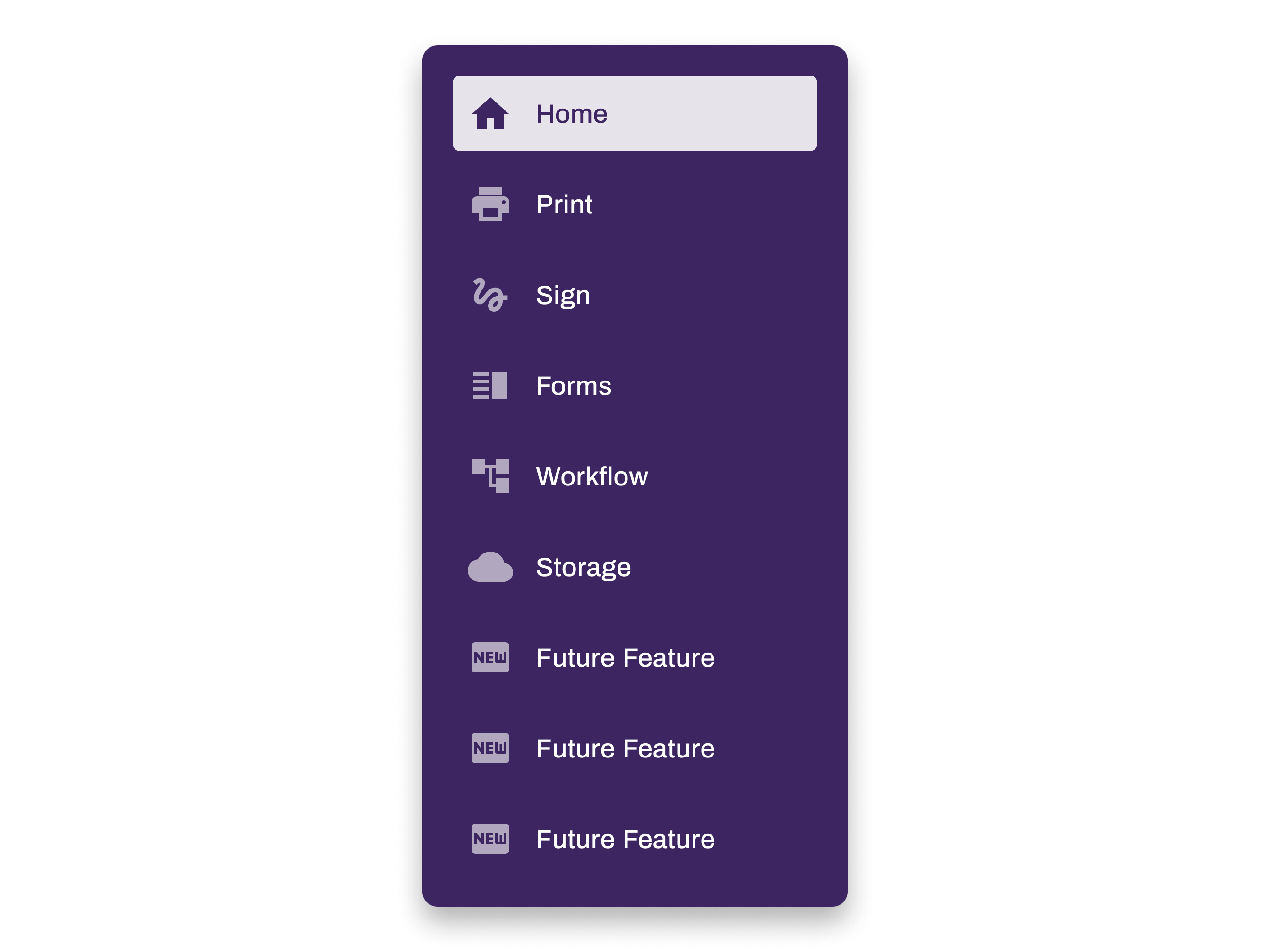
New features can be added without revisiting the navigation structure.