Vasion Design System
Led the creation of Vasion's first true design system, cutting design time by an estimated 50%.

Context
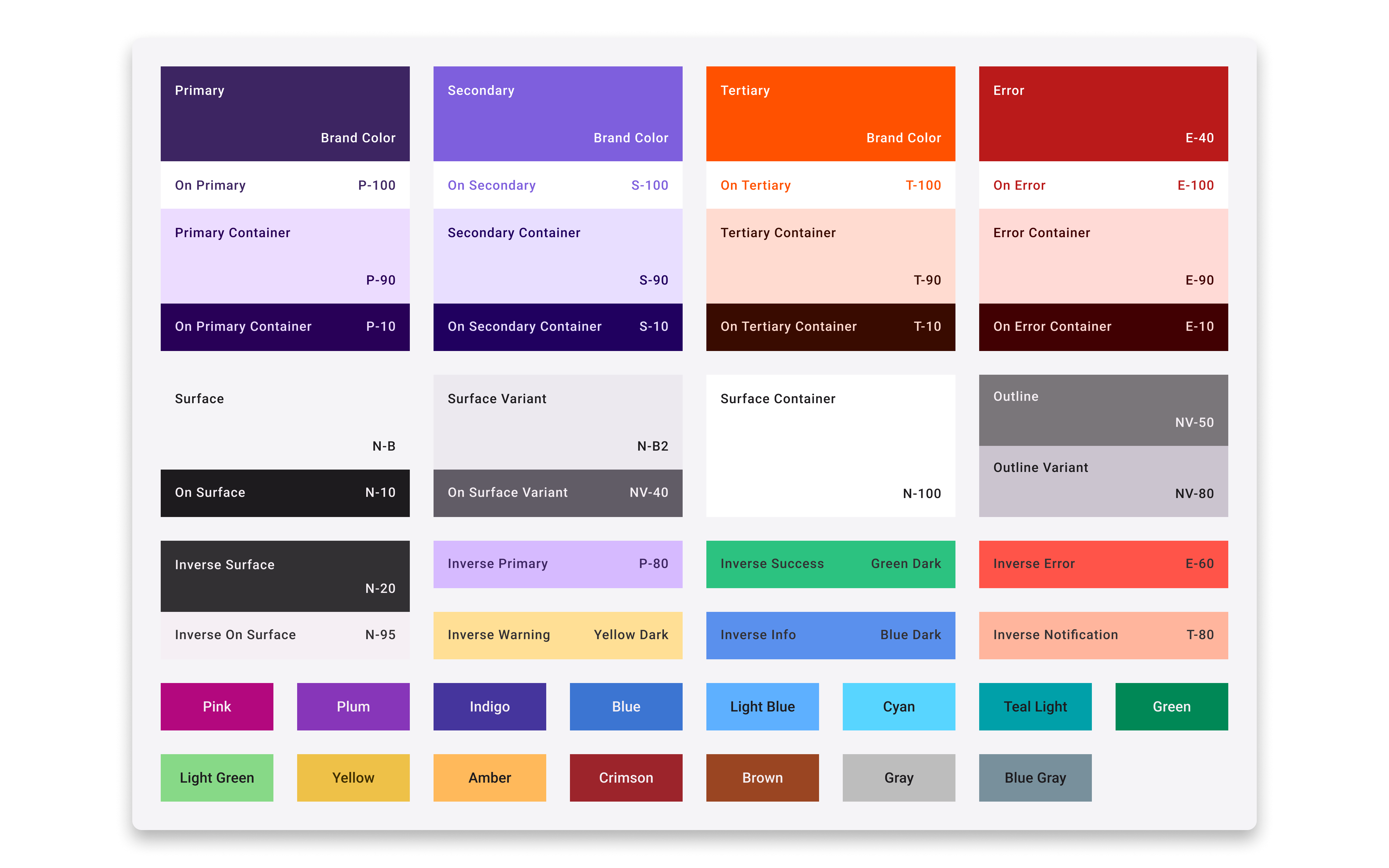
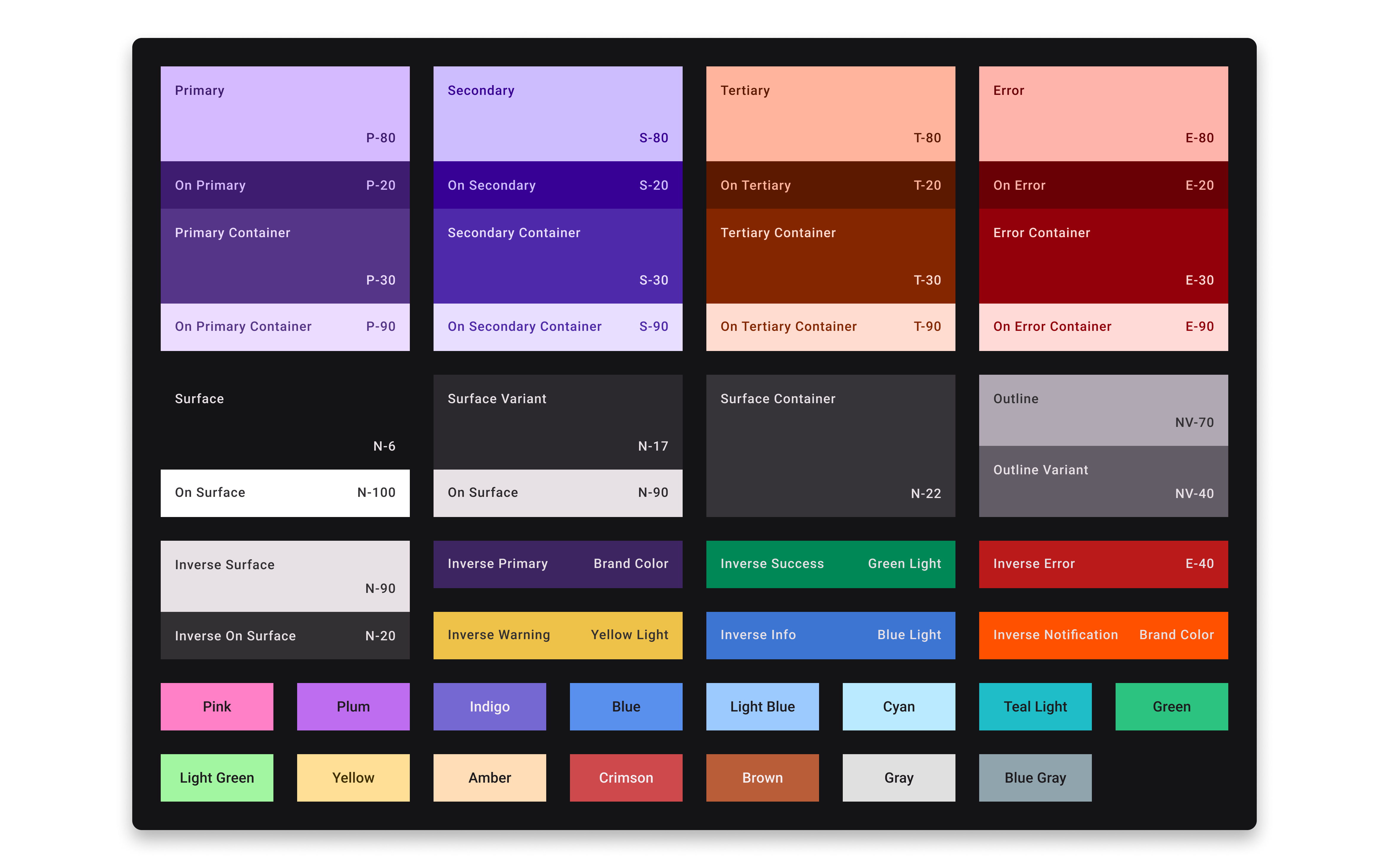
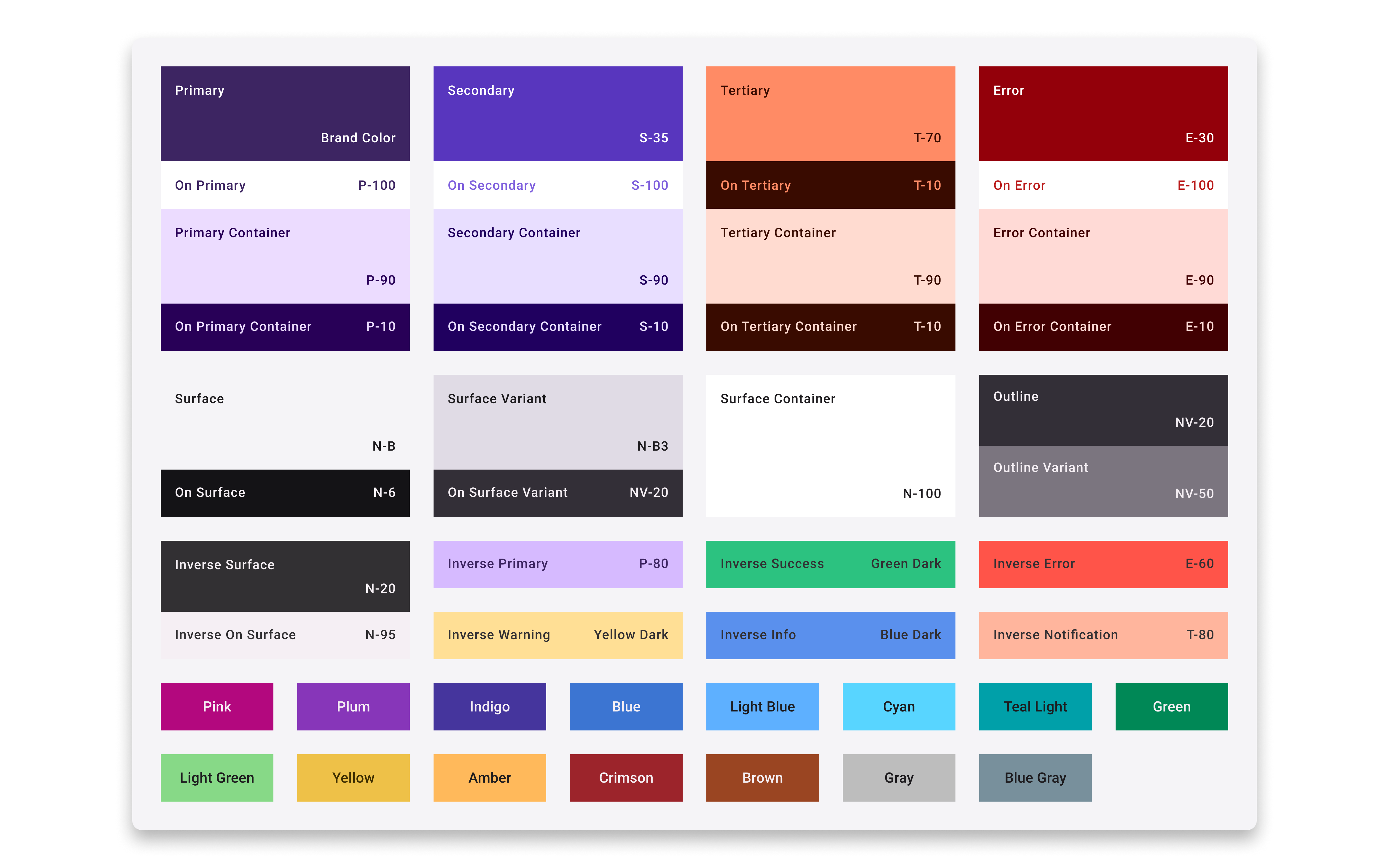
Background. Vasion was preparing to launch a new product, a significant strategic shift that required a modern, scalable design foundation. The existing system couldn't support it. It was incomplete, inflexible, and had no documented usage guidelines. Designers regularly detached components and built custom solutions, creating visible inconsistency and a growing debt of one-off decisions that were hard to maintain or scale.
The Real Problem. On the surface, the system looked like a tooling issue. But the deeper problem was structural: no single source of truth, no shared language between design and engineering, and no defined owner. Every designer was making independent decisions about the same components. Each new feature inherited the ambiguity of the last, making it harder and slower to design anything predictably.
Constraints
Mismatched Framework Standards. Vasion's front-end is built on Vuetify, which is based on Material Design 2, not the more modern Material 3 spec I was designing to.
Vuetify's Limitations. Vuetify's component customization is rigid. Some design decisions that were clearly better had to be scoped back based on what the framework could support.
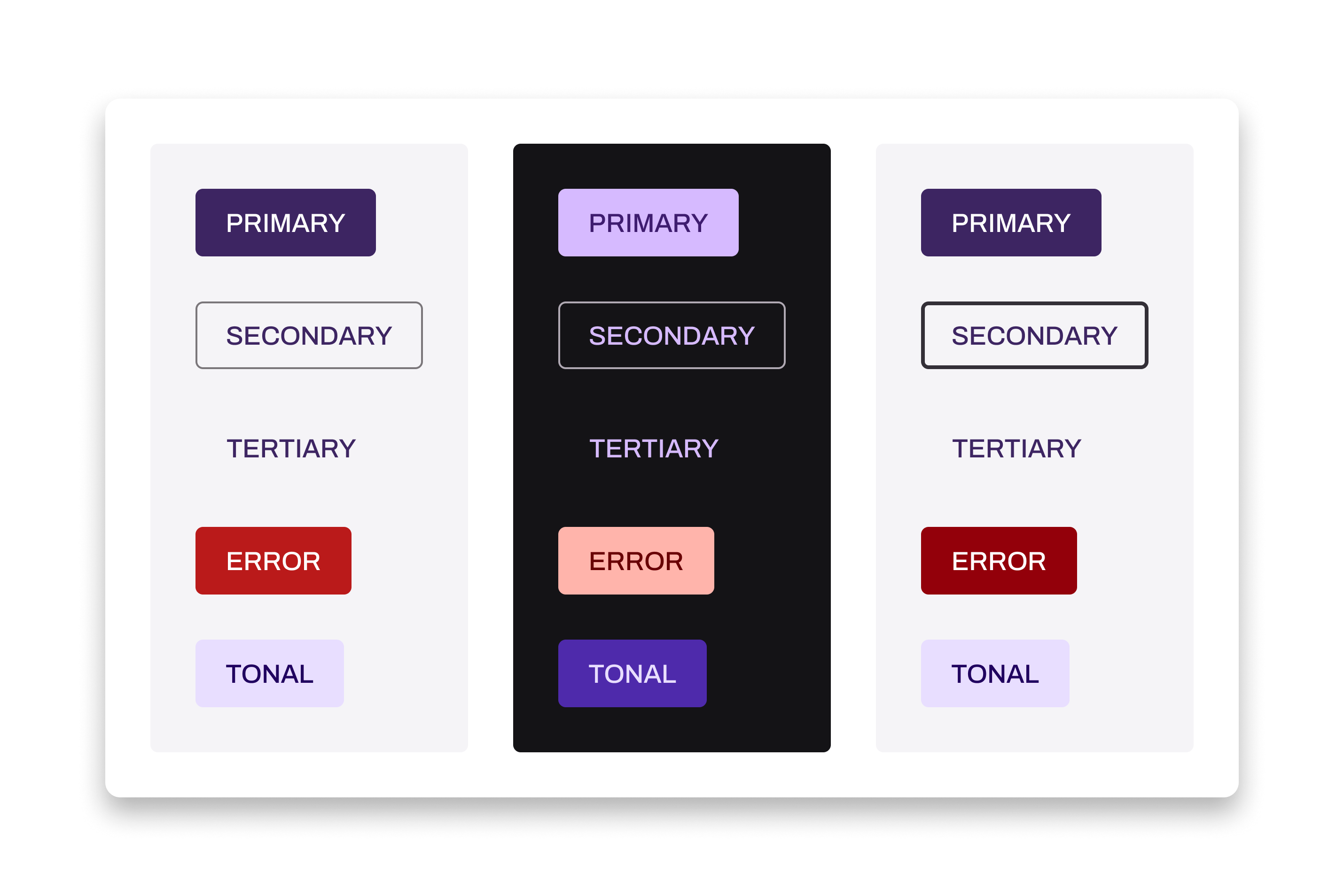
Key Decisions
Date Picker: Concede Style, Protect Usability. The date range picker I designed was based on Material 3 specs, but Vuetify runs on Material 2 with limited customization ability. Rather than push for a pixel-perfect implementation, I adapted to the older style, preserving full usability while accepting the visual tradeoff. I documented the constraint so future designers understood the decision.
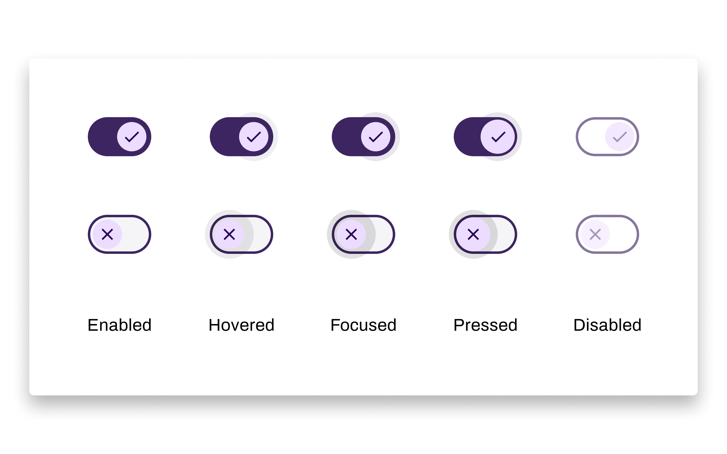
Switch Component: Fight for Accessibility. The design team aligned on always including an icon inside the switch component to ensure accessibility. Vuetify didn't natively support this variant, so I worked directly with the dev team to find a feasible implementation path. Design intent and engineering effort were both justified by the accessibility requirement.
Codifying Guidelines Through Collaboration. Rather than writing usage guidelines alone, I ran weekly component syncs with the design team over two months to define standards collaboratively. This slowed the process slightly but dramatically increased adoption. Designers helped shape the rules they'd be following, which meant fewer workarounds later.
Outcomes
- Full adoption across the design team within weeks of launch
- Estimated 50% reduction in time to complete design work
- Approximately 4 hours of design rework eliminated per project
- Established a consistent visual and interaction language across both products
- I became the team's primary resource for component questions and system decisions
- The system continues to evolve, additions are now reviewed and documented rather than improvised
Reflection
If I were starting over, I would have pushed harder and earlier for a conversation about the front-end framework. We were early enough in the new product's development that switching away from Vuetify was still feasible. That window has since closed. The design system is good, but it's built on constraints that limit how far it can go visually.
This project changed the way I work. I think in systems now. Before this, I was designing features. After this, I started designing the rules that features follow, which made me significantly more valuable to both the design team and company. Ownership over the system means every inconsistency is something I feel responsible for fixing, not just flagging.
Component Highlights
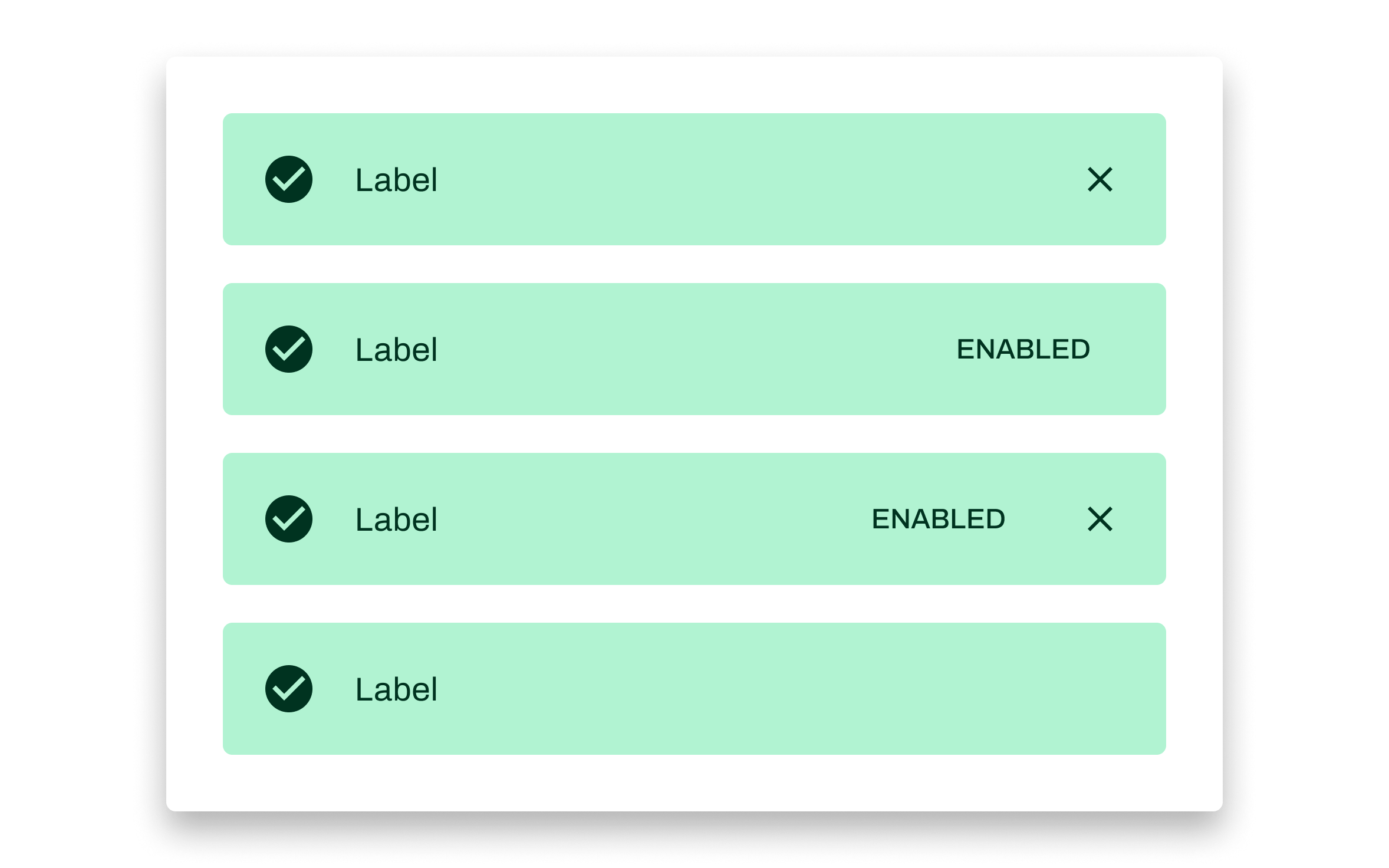
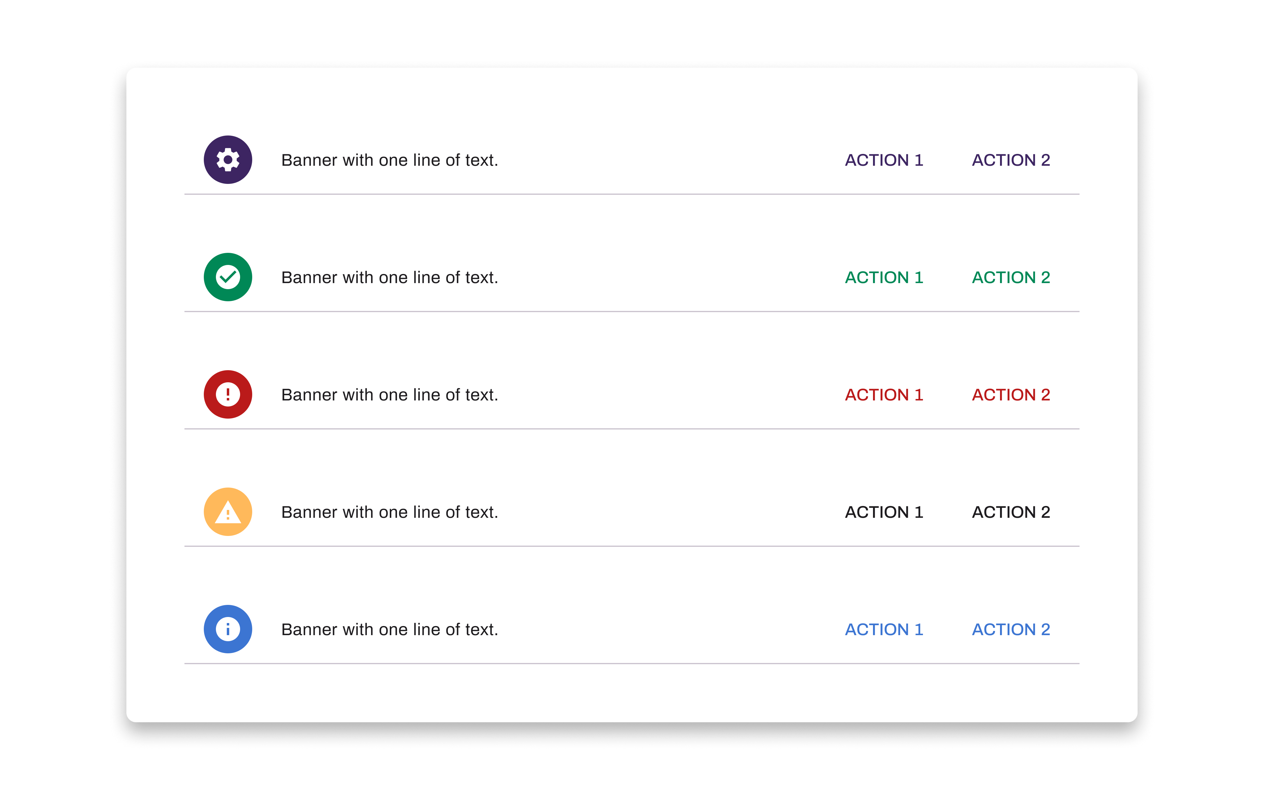
The alert component supports variants for action buttons, status labels, and dismiss controls, so each use case is covered by the system, not improvised.
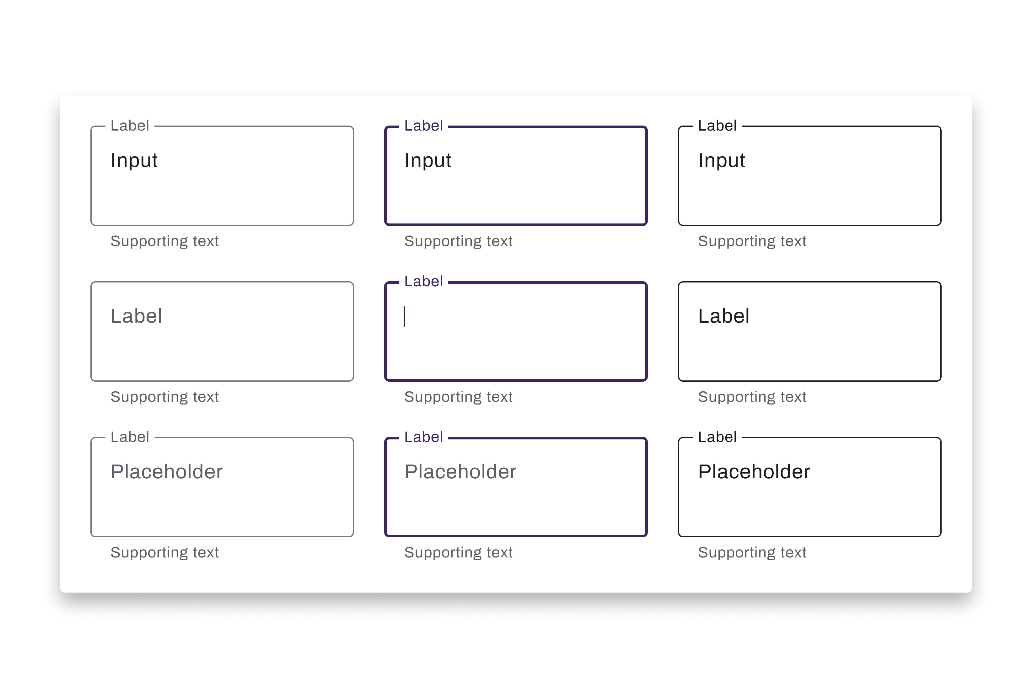
The text area component was custom-built in Figma, extending the text field's interaction patterns to maintain consistency.